Before you can connect the dots, you have to find them.
Data submitted by the public is now integrated into the interactive California broadband availability map, which is published by the California Public Utilities Commission.
The map has been evolving for the past five years, starting out as a set of static graphic files. With the help of funding from the 2009 federal broadband stimulus program (which is nearly gone), it migrated to an interactive online platform developed by Chico State University. It’s gone through a series of upgrades, with the latest one adding two interesting – and possibly controversial – crowdsourced data sets.
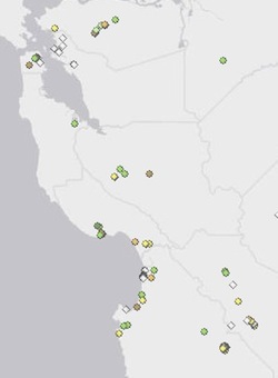
One is made up of mobile broadband speeds tests done by anyone who wants to download the commission’s CalSpeed app and run it on an Android phone. The app automatically uploads the results to a central server. The latest version of the map displays that data, regardless of who submits it, so long as the test was run on a phone that can handle the app’s maximum speeds. (There would be little point in displaying results that are limited by test device rather than the service being measured).
The other crowdsourced data set is information submitted, for now, by regional broadband consortia. It’s essentially free form, and the validity of any particular data point is naturally open to debate, but it could become a useful tool for consortia and other community broadband advocates to counter what they consider to be inflated service provider claims with their own ground truth.
The CalSpeed and public feedback data is displayed as a selectable “layer” on the map, as are broadband availability claims submitted by carriers, results from the CPUC’s own mobile testing program and other information, such as broadband adoption rates and FCC tower locations. The map has also been updated with the data submitted by carriers as of the end of last year.
